Monitoring dashboards inform crucial decisions for improving program implementation in the social sector. But building a dashboard is not as simple as throwing together some charts of your indicators; there is a structured approach to it. This blog post offers 7 pieces of wisdom to help you build great dashboards.
1. Get clear about why you need a dashboard
More than just a visual display of data, dashboards are tools that drive key decisions. If you are planning to build a dashboard, ask yourself: Who are the users? What decisions do they need to make, and how often? The decision-making process is user-specific, and thus a dashboard should be designed with only a limited set of users in consideration.
When you are convinced that there exists a set of indicators that need regular monitoring and the decision-makers have an appetite for the same, convince the stakeholders, including yourself, that a dashboard is what’s really needed. For example, the need to monitor frontline worker activity is a great dashboard use-case for a healthcare non-profit, but a live dashboard to track internal budget is overkill if budgeting happens just once a year.
It’s worth being a devil’s advocate from the beginning to assess how your dashboard might fail to do a good job. For example, consider constraints regarding device access, preference, internet connectivity, and language. The last thing you want is to build a cool piece of software that no one would use.
Throughout the process, ask yourself, “how much value is this adding over a spreadsheet?”
2. Don’t skip the homework
Part 1: Understand the users
Start with in-depth research about your dashboard’s target users. What activities do they engage in? What decisions do they get stuck at? Answers to these would inform you about the user’s value system – what they care about the most and what they don’t care about at all. Additionally, this research would inform you about the granularity of data that you would need to create visualizations.
Also, note the number and types of users that require a monitoring system. It’s hard to optimize a single dashboard design for different decision-makers, especially if they are at different levels in the organizational hierarchy. If you discover a huge variation within your target user group, you may need to target more specifically. Alternatively, you could keep multiple landing screens for each user type or, in some cases build multiple dashboards.
Know and be okay with the fact that you can’t give everyone everything at once.

3. Prioritize what needs to be visualized
A dashboard’s real estate is limited, as is the user’s attention span. Putting every possible indicator will render the dashboard too cluttered and perhaps too generic to be useful. You need to think well about indicator priority before jumping into the development process.
Keep in mind, not all indicators are that important.
While you’ll discover indicators of primary concern for the users from your conversations, they could be different from those that reflect if the program being monitored is achieving desired outcomes. In that sense, the indicator selection process is a bit tricky. What will help you is a prioritization framework firmly rooted in the organization’s theories of change while addressing the monitoring needs of the decision-makers.
This process is crucial as it helps constrain the amount of information relevant to the dashboard. Skipping this will lead to a lot of spontaneous iterations later in the development stages as you and your users continually discover new and important indicators.
Keep in mind, not all indicators are that important.

4. Don’t skip the homework
Part 2: Understand dashboard tools
The quickest way to make great dashboards is to use drag-and-drop tools like Tableau and Google Data Studio or code-driven tools like R Shiny.
All these offer an inevitable tradeoff between cost, learning curve, and range of possible features. To settle upon one, you have to consider many other factors in the project–the developer team’s capability, shipment urgency, feature requests, and post-delivery maintainability. We at IDinsight put special emphasis on cost and maintainability because many of our clients aren’t equipped to pay hefty licensing fees or manage a team of developers.
If you decide to build a dashboard in-house using any of these tools, first try to get a good sense of the features that the tool can and cannot offer. Your users’ experience with the dashboard would be intricately linked to the technical features that can be incorporated into it.
Design and engineering go hand-in-hand.
5. Go visual!
With knowledge of the dashboarding tool’s potential to fulfill user needs, you should be at a stage to think about the interface design. The interface should deliver an experience that strongly informs the decisions the user needs to make. For reference, you could review existing public dashboards similar to your use case or pick inspiration from websites like Dribbble and other tool-specific galleries.1 It will also be helpful to brush up on best practices around data visualization.2
It is recommended to use wireframing tools for your first draft.
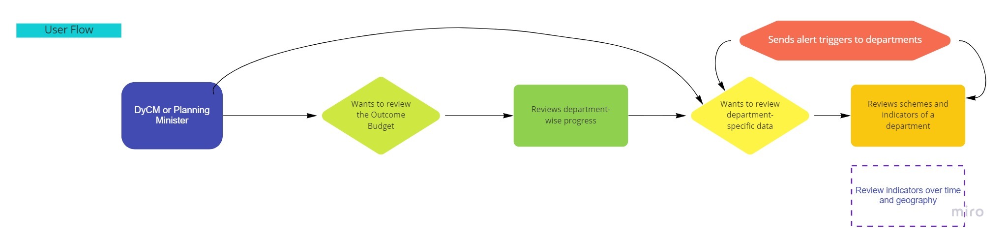
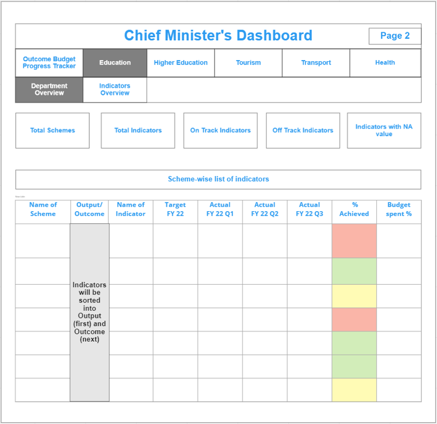
If there are equivalent indicator buckets within the dashboard’s scope, like for various departments within a government, you could dedicate a separate page for each bucket. It is best to start the flow with a high-level overview followed by deep dives into various dimensions of the program being monitored (across time, geography, or other units of interest). Referring to the indicator prioritization framework, you should narrow down the types of charts you’d require, their X and Y axes, and what filters they would be responsive to.
It is recommended to use wireframing tools for your first draft. Miro, Draw, PowerPoint, or sometimes just pen and paper sketches are great for communicating ideas that are difficult to present verbally.
Visual ideas deserve visual representation.
6. Embrace the crash test
Be quick to present the first draft to your users and solicit feedback, either as a wireframe or a scrappy prototype. Talk about why you made certain design choices and seek the user’s input on usability. The intention is to test your assumptions and check for key requirements you might have missed in your first draft.
It is important that you don’t start building data pipelines right away.
Also, keep examples of similar dashboards handy in case you need to showcase other features or design options. Note that the user might raise new feature requests, but since not all features would be high priority or feasible, try to address the user’s concerns behind the requests and not the requests themselves.
It is important that you don’t start building data pipelines right away. Use dummy data until the user approves the first draft because it’s completely possible that they suggest some heavy changes. With this first set of inputs, you may need to reassess the project timeline, rebuild expectations and possibly revisit the drawing board.
You can’t fall in love with your dashboard just yet.
7. Iterate enough, iterate a lot…
With a first draft approved, you can safely move away from the wireframe and start using the shortlisted dashboard tool. For radically different ideas that occur to you or your users, later on, use wireframe sketches again. But make sure you are also well-versed with the advanced features of your dashboard tool because not all features can be captured in sketches. Concurrently, you should start engineering the data pipelines at this stage.
However, keep in mind that priorities shift all the time in software development. It takes time to assess if the final output is delivering the value originally expected. The good thing, though, is that you need not finalize every detail at once – you can focus on the big boulders first (the non-negotiable asks) and pebbles later on (the bells and whistles). And this can be easily managed over multiple iterations of development and feedback. So make sure to pay your users a visit at regular intervals.
You not only make dashboards for your users but also with them.
Conclusion
Dashboard development, just like regular software development, is not straightforward. But it is manageable through an iterative development process. Your dashboard tools’ feature limitations are the only hard constraints you need to remember. From there, it’s just about addressing user needs and relieving their pain points in the best way possible.
This article was originally published on IDinsight.
—
Footnotes:
- Check out these showcases for PowerBI and R Shiny
- See the CRAP principle and Stephen Few’s articles on dashboard colors and design.