Designing for social change is not a new concept. Every day, individuals and organizations working across the social impact space create and conceptualize new products, programs, or services for the communities they serve—be it a new lamp powered by solar energy, easier access to clean drinking water, FemTech innovations, or providing online education to parents.
Service design—the process of optimizing both a service provider and user’s experience—has a particularly important role to play in solving complex social challenges, given its co-creative and human-centered approach.
At Noora Health, we continuously use service design to revamp, redesign, or create entirely new services in order to deepen our impact and engagement with the caregivers, patients, and healthcare providers we collaborate with. Often, the different touchpoints between a service provider and user are designed by separate teams or verticals. Think of an app designed by a software engineer and a takeaway pamphlet conceptualized by a communications designer. Both are part of the same health education service for new mothers and their families, but developed deliberately in silos, which can ultimately lead to less intuitive offerings or support for the end user.
As service designers, we cut through the silos and glue the pieces together. Once the end-to-end service is in place, it’s important to communicate it to the relevant stakeholders, especially those implementing and delivering the work in practice. This helps build a shared understanding and collect feedback.
A service prototype is a great way of achieving these objectives. Typically done in the early stages of design, one can do this by creating a quick video, roleplaying or enacting the service from beginning to end, or even using Lego sets to create a model of the service that people can ‘walk through’ with their hands. This helps the end-users understand or experience the service as a whole, while also gathering their feedback.
Walkthroughs: Simulating a service experience
Although service prototypes are the best way of testing the strengths and weaknesses of a service, they can often be time and resource intensive. Much of our work at Noora Health is in collaboration with partners across the public health system who have their own (often constrained) timelines. This often leaves us with limited time to prototype and test the end-to-end service in sequence with health staff and end-users.
However, to ensure the quality of our service and its uptake across healthcare facilities, we still need to gather feedback and explain it to teams implementing it in hospitals on a day-to-day basis.
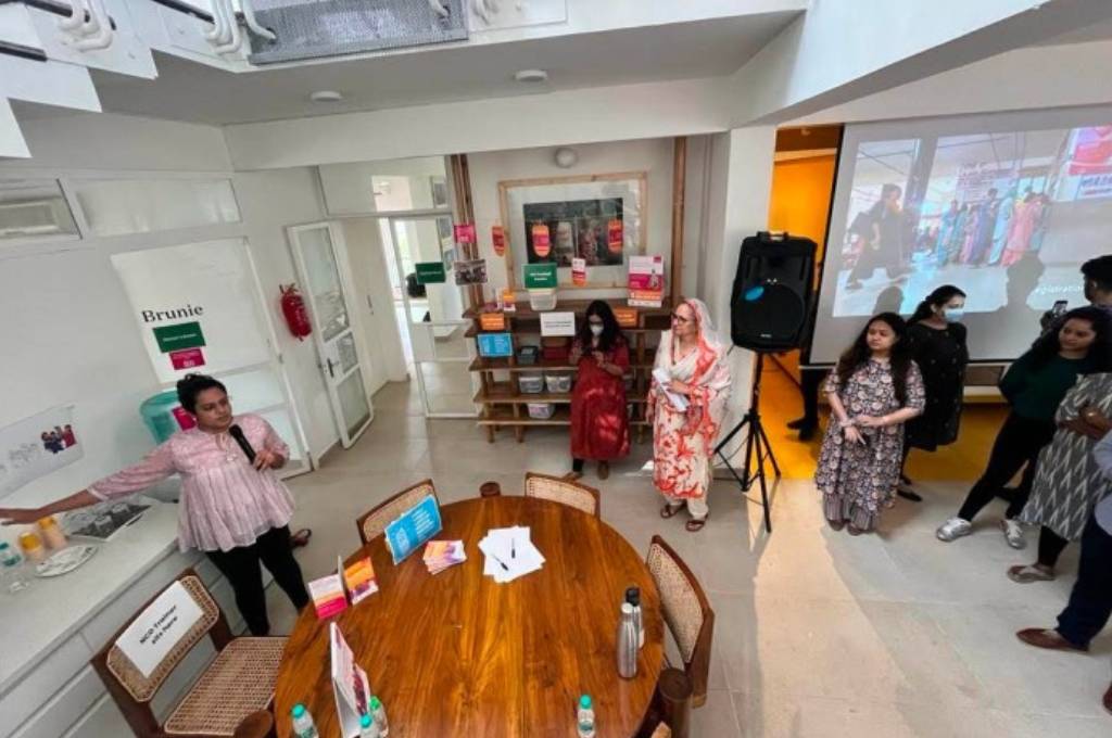
Back in November 2022, this need led to the creation of our first ever ‘service walkthrough’—an interactive, live service that allowed internal stakeholders to experience the key, near-final tools and components in the same sequence as the intended experience of the end-user, whilst being guided by a facilitator. While this may sound similar to a service prototype in many ways, the walkthrough has three core elements that set it apart: the intended audiences (internal stakeholders), stage of completion of tools (final), and the use of a facilitator (who helps the audience understand the nuances and details of each touchpoint and tool, as well as content and communication strategies).
How did we make it happen?
First, we set out to recreate the hospital environment within the four walls of our office. To do this we allocated spaces and rooms to mirror the touchpoints in the hospital, such as the pharmacy or the inpatient ward. To make it feel more realistic, we took pictures of the facilities, printed and stuck them up in each location. Additionally, we played four short videos on loop on a projector to give people the experience of being in a noisy and crowded hospital. We also placed all of the tools and components designed by the program design and development team, such as danglers and flipcharts, in their intended locations.
Next, we printed signs explaining the different hospital staff who would be present in each room, the various interactions between staff and patients that would take place, and the amount of time the staff, patients, and caregivers are expected to spend at each touchpoint.
Finally, we sequentially took various team members through the service explaining each point of contact in detail from start to finish. We explained what the patients and families already experience at the hospitals, and what additional artifacts and interactions we are placing in front of them, and how that would impact their experience.
What were some of the key outcomes of the walkthrough?
Teams across the organization found value in the walkthrough. For instance, the implementation teams responsible for setting the program up in public health facilities understood it well, asked pointed questions, and provided valuable feedback that helped us either iterate quickly or plan for feedback and validation post-launch. The research team—who were planning to test some of our artifacts in hospitals—were able to better understand the artifacts, as well as the context of the service they sit in. While observing the walkthrough unfold, the team that designed the program tools and flow were able to spot gaps and plan for quick iteration.
In an unexpected win, the training team was also inspired to set up the space for their sessions in a similar manner, so that participating nurses could experience firsthand what the program will look and feel like.
What did we learn?
Like any well-designed prototyping exercise, the walkthrough showed us both what we were doing well, and what we could do better. A few of our takeaways were:
- Conduct a version of the walkthrough sooner: While it is extremely important for teams to go through the final version of the experience, we found that it didn’t give us enough leeway to incorporate and iterate on their feedback. Having a walkthrough of the semi-complete service and tools would allow us to do so.
- Get feedback on the walkthrough from health staff, patients, and caregivers: While we conduct intensive needs assessments to understand what patients, their caregivers, and health staff really need, test individual touchpoints and tools with them, and co-create as much as possible—we don’t always have time to test our entire service with them sequentially. Feedback on the end-to-end service walkthrough from people with lived experiences of working in and navigating healthcare settings would help us catch any gaps and make our service more comprehensive—aspects that would otherwise ideally get covered in the prototyping stage.
- Make it self-explanatory: Rather than depending on facilitators, we realized that allowing people to walk through it at their own pace would help them focus on the parts they care more about. For example, the training team would need to understand the session in the wards over any other part of the service. Doing it at their own pace could have helped them dive deeper into that section, and provide more nuanced feedback.
- Document, document, document: Though we created a video recording of the walkthrough, it was too long and too focused on the facilitation rather than the tools and signage. To make sure that people can refer back to service at any point in the future, we understood that it needed to be documented in multiple formats that would make it easier to access.
- Create a virtual version: Our original walkthrough had the option to be hybrid, but we observed that the experience was notably better for people who experienced it in person.
Taking these insights onboard, nearly a year later, we experimented with a completely virtual walkthrough when testing out a new service.
Bringing the virtual walkthrough to life
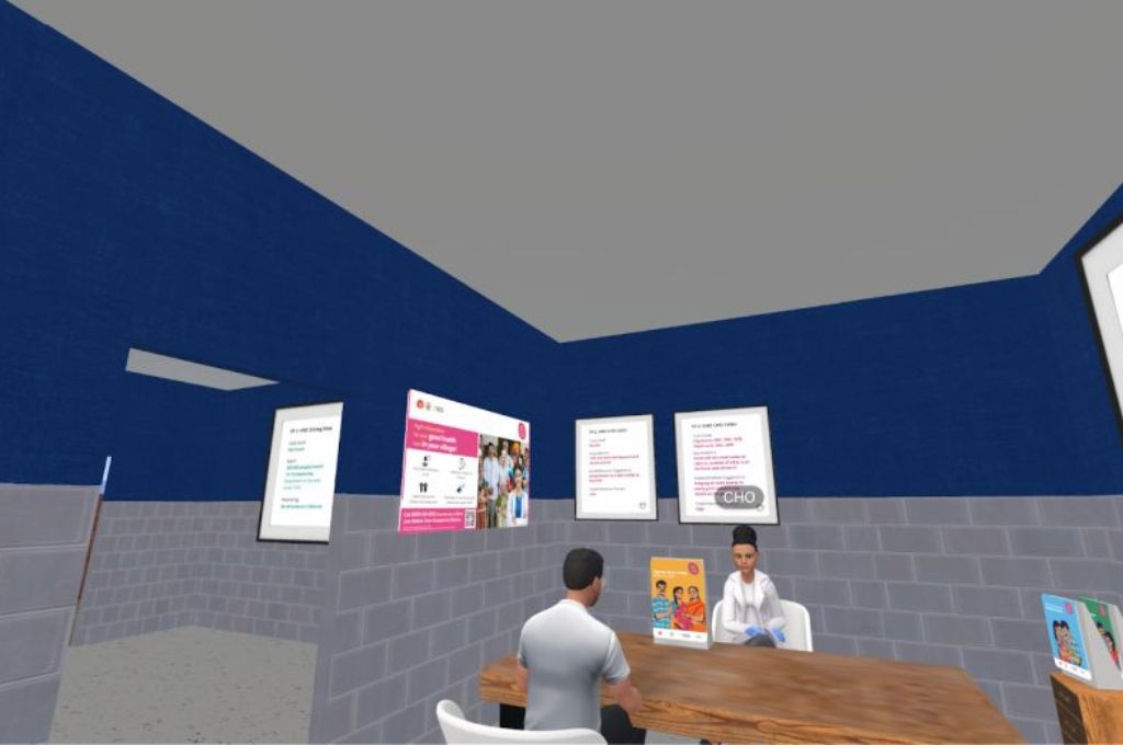
Similar to the in-person experience, our starting point for the virtual walkthrough was creating a three dimensional model that represented the various points of engagement. This was then uploaded into a virtual world on spatial.io.
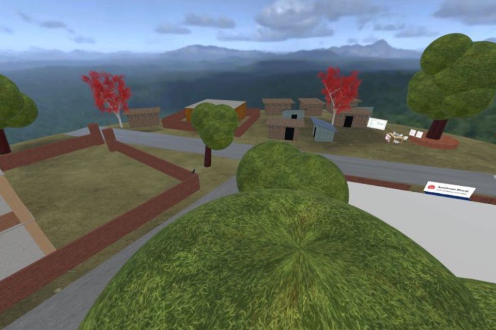
By creating avatars in the virtual world, anyone could join the experience and interact with the service touchpoints and tools.
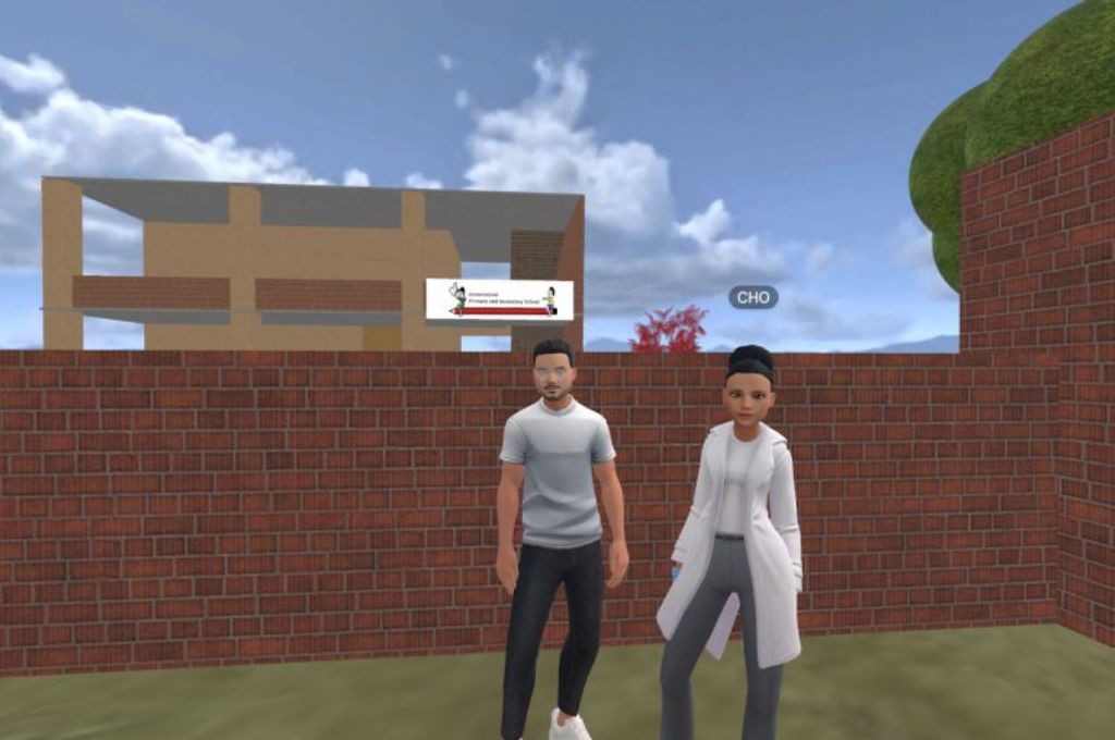
We conducted the walkthrough by roleplaying healthcare workers, patients, and caregivers and acted out real-life scenarios that we imagined would exist within our intervention.
The pros and cons of going virtual
Like its physical counterpart, the virtual walkthrough was also successful in explaining the service and generating actionable feedback for us. It was also extremely useful to bridge the disconnect with team members working remotely across geographies.
We also found a few areas for improvement. First, due to the limitations of the virtual platform used, actual interaction with the touchpoints was more restricted than we had predicted. For instance, many key stakeholders were unable to hold, touch, and feel the artifacts and tools that they would eventually implement and deliver, limiting their engagement and leading to some confusion around the actual size of the tools and how they were to be placed in the facilities.
Both the in-person walkthrough and the 3D, virtual walkthrough proved invaluable in enhancing communication and understanding for our internal stakeholders, as well as getting feedback from them.
Refining, adapting, growing
Recently, we have designed yet another version of the service walkthrough for our newly-launched program in Indonesia. Here, we used storyboards on a Miro to try out another way of communicating services virtually. Similarly, the team in Bangladesh is gearing up to do both early-stage, low fidelity service prototyping and a high fidelity, more final service walkthrough soon after. As we continue scaling and expanding across countries, internal walkthroughs have become the norm, and rightly so. They help get people on the same page, get feedback, and test more, in order to ensure high quality service delivery. What’s more, now that internal stakeholders are used to walkthroughs and are seeing more value in them, we have been able to advocate for longer duration, low fidelity service prototyping more easily.
From each iteration, we are consistently learning and generating ideas to make the service more user-friendly and holistic. Social change is complex, but service walkthroughs (or any other form of service prototyping) can help keep people at the heart of it. We hope that sharing our insights and observations will help build more thoughtful and intuitive public healthcare services, allowing us to learn from each other’s experiences and strengthen the system as a whole.
This article was originally published on Noora Health.


