Building technology for nonprofits presents a unique design challenge. Nonprofits operate with limited resources, uneven levels of technical capacity, and constant pressure to demonstrate impact. Designing technology that works for the sector, therefore, requires more than just technical know-how; it involves understanding and addressing these realities head-on.
Through our work and conversations with nonprofits, one persistent challenge stood out: data. Many organisations collect data through multiple tools, but it often ends up scattered across siloes and incompatible formats. Merging and transforming this data is difficult and time-consuming, requiring weeks of manual cleaning to bring out meaningful insights.
In effect, nonprofits spend too much time wrangling data and not enough learning from it. This fragmentation also limits data access, with insights often restricted to senior leadership or funders rather than shared across teams that could act on them.
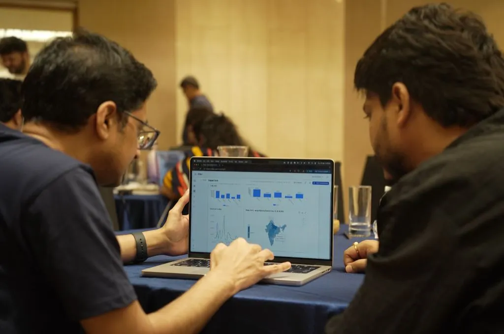
What was missing was a simple platform that could automatically and seamlessly pull, clean, and visualise data from different sources. This led to the development of Dalgo, an open-source platform that helps nonprofits reliably automate the flow of data to dashboards, enabling them to spend more time learning from data as opposed to uploading, cleaning, and computing it.
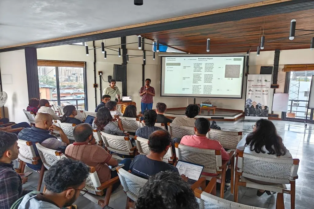
In the two years since its launch, our nonprofit partners have shared valuable feedback on usability, storytelling, and how thoughtful design can help the sector move from merely managing data to truly learning from and leading with it. Most importantly, the feedback has sharpened our understanding of what nonprofit-centric design looks like.
Here are the core lessons that continue to mould our approach:
1. Design for every stakeholder
The platform’s initial version helped transform messy raw data into reliable insights by generating structured tables and enabling visualisation. However, it still required a degree of technical proficiency, such as familiarity with basic structured query language (SQL), which meant it was more readily usable by larger organisations with trained or tech-savvy staff.
Many organisations, however, do not have the resources for a dedicated technology team. Instead, responsibility for data often falls to programme or monitoring and evaluation (M&E) staff, who are expected to manage datasets, build dashboards, and produce reports alongside their core responsibilities.

Therefore, a key learning for us was that this platform, or any similar tool, must be designed for the realities of the nonprofit ecosystem.
2. Build both push and pull models
As we worked to make the platform easier to use for all, another learning became clear: making data available is not the same as making it usable. Different people within an organisation consume insights in different ways, and not everyone will want a dashboard. Some teams, such as programmes and M&E, regularly open dashboards to review progress and spot trends. They actively ‘pull’ information from dashboards when they need it. Others, however, benefit more from insights delivered to them directly.
For instance, a partner at Sanitation and Health Rights in India, which works to strengthen sanitation systems, noted that while many toilet facility staff may never open the data dashboard, they regularly review the daily automated report that the platform generates. This report helps them confirm whether data on quality and facility use have been entered correctly. Another partner shared that if a water purifier stops working, field officers simply need an alert to respond to the problem. These conversations made it clear that making data useful means supporting both modes: dashboards for teams that actively analyse data, and alerts or summaries that ‘push’ relevant insights to those who need to act quickly.
The real gap isn’t only automation or access, but how easily teams can use data in their day-to-day decisions to drive action and tell clear, meaningful stories internally and externally.
3. Integrate storytelling with statistics
We’ve seen how automating data work can significantly cut effort. At Sanitation and Health Rights in India, for instance, weekly data-cleaning time dropped from more than 20 hours to less than one. But our users also indicated that for many of them, the end-goal isn’t an automated dashboard—it’s the deck, brief, or report they use to tell their stories to donors, partners, and peers.
Take a nonprofit conducting a maternal health intervention. Data becomes far more useful when a dashboard goes beyond reporting how many mothers were reached to also capturing whether the quality of engagement improved, what mothers found helpful or challenging, and where the programme could adapt. When quantitative data is paired with qualitative field insights, teams don’t just see numbers. They also understand what those numbers mean and reflect.
Real learning happens at this intersection of statistics and storytelling.
4. When nonprofits know their data, they ask better questions
As teams save time previously spent crunching numbers, they are able to focus more closely on programme practice. Instead of saying, “It’s tough to even monitor our programme,” we increasingly hear nonprofits ask, “Now that we can monitor it regularly, what’s next? What more can we do?”
With easier and more reliable access to data, organisations are becoming more familiar with it. They are spending more time on research and exploring ways to integrate public data sets into the platform to develop greater knowledge of the regions they work in. Other common asks include simplifying insights for teams who aren’t familiar with dashboards, better ways to analyse qualitative data alongside numbers, and the ability to use predictive analytics and identify patterns or correlations across different programmes.
5. But what about AI?
AI is advancing quickly, and many nonprofits are excited about its potential. But when it comes to data, reliability is essential. If AI tools compromise trust in the data, nonprofits are unlikely to adopt them meaningfully.
While AI can help with making sense of nonprofit data, it doesn’t always offer consistent or context-aware results. Therefore, it’s important to test carefully where it adds value and where human judgment must remain central.
How do these lessons affect the nonprofit sector?
Nonprofits run on trust. Trust runs on data. While accessing and managing data has become easier thanks to a growing ecosystem of tools and support, the real opportunity lies in how data is used. Practices that once felt ambitious for smaller organisations are now well within reach.
With reliable systems and regular insights, organisations can use data not just for reporting outcomes, but also to learn, adapt, and plan ahead.
As technology builders in this ecosystem, we also recognise that data is only one part of the puzzle. This is why our role goes beyond building platforms—it involves listening, learning, and engaging with more nonprofits to support their journey towards data confidence. Sustained engagement between nonprofits and ecosystem actors will be key to creating a more effective, trustworthy tech and data landscape for the sector.
—
Know more
- Learn how nonprofits can approach data management and tools like dashboards.
- Learn more about the platform’s evolution towards serving the nonprofit ecosystem’s data needs more effectively.
Do more
- Reach out to Dalgo to learn more about how it can help you with your data needs.
- If you’re a nonprofit, funder, or network partner interested in strengthening the tech and data ecosystem, contact us at partnerships@dalgo.org.