For years, heat has been framed as an ‘invisible’ threat, mostly because it does not leave behind dramatic visuals. But heat is no longer invisible or silent: forests are ablaze, rivers are drying up, air conditioners are short-circuiting, and surges in fires in residential areas due to record-breaking temperatures are pushing firefighters to the brink. Heat now arrives with force, causing approximately 1,56,000 deaths per year in India, according to the Global Burden of Diseases. It seeps into homes, disrupts sleep, worsens chronic illnesses, reduces productivity, increases food and water insecurity, and forces impossible choices: work through the heat or go without pay. It’s being felt more widely too, with 71 percent Indians having experienced severe heatwaves in the past year.
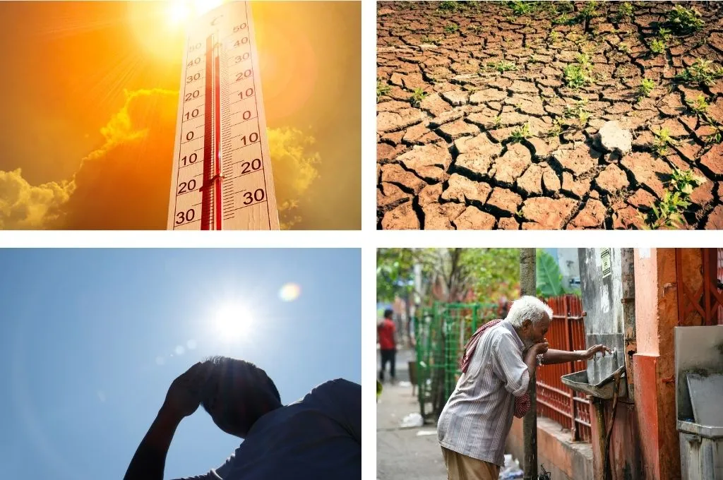
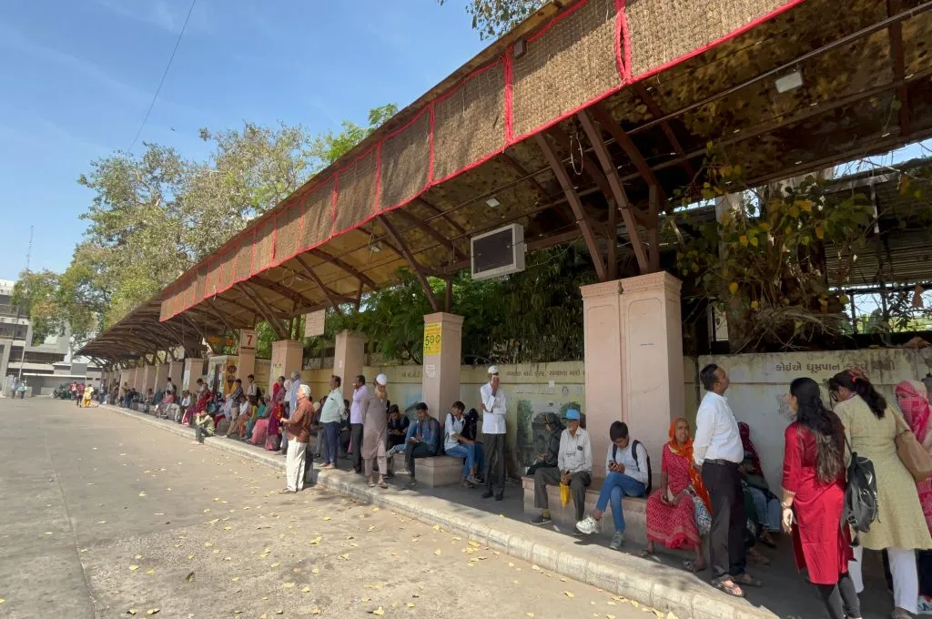
Yet despite growing public and policy awareness, the way we represent heat—both visually and through data—hasn’t kept up. It remains stuck in abstraction and is often portrayed as ambient and impersonal, through red thermometers, empty roads, or people splashing water over their heads. This, in turn, informs how policies and practices around heat are formulated and implemented.
This invisibility extends to data too. Even where evidence exists—satellite imagery, land temperature patterns, cooling access gaps—it’s rarely visualised in ways that are accessible, locally relevant, or emotionally compelling to the extent that they prompt urgent action.
In our own work, whether communicating heat action plans (HAPs) and their implementation or the health impacts of heatwaves, we have struggled to find visuals that match the scale, urgency, and lived realities revealed by our research. As communicators and practitioners working to map heat risk, we must rethink how we see and show heat. This guide offers practical tools to change that—from more grounded photography to better use of satellite imagery, maps, and data visualisation—and outlines how donors can help move the needle.

We need to depict the experience of heat more accurately
Beyond the overuse of generic and repetitive visuals, we also overlook the more subtle and often forgotten dimensions of heat. For instance:
1. Heat has temporal dimensions. Its impacts are not only felt immediately, for instance in the form of a heat stroke, but also over time. However, most imagery fails to capture the duration of heat exposure, how it builds over weeks and months, or the chronic stress that living through relentless heat puts on people and systems daily.
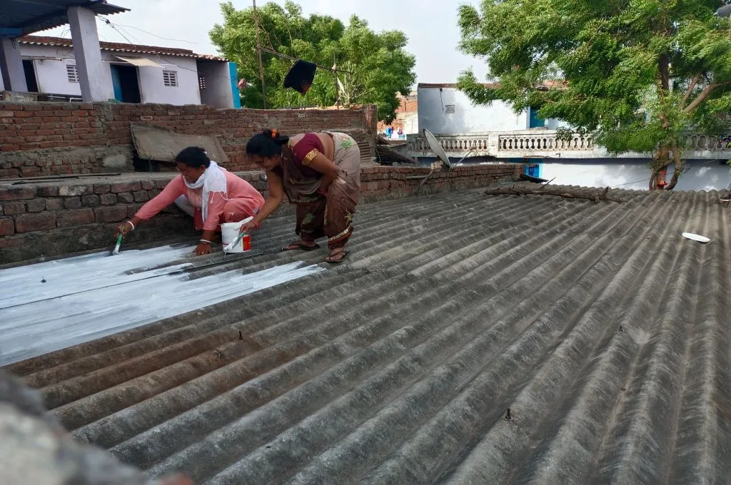
2. Visuals can show not just rising temperatures, but how heat shapes everyday life. Heat is often presented in isolation, disconnected from its cascading effects. Rarely do we see visuals of how it disrupts children’s school attendance, affects maternal and mental health, reduces access to food and water, or strains power systems and public mobility. We also almost never show the places where heat is ever-present and whom it hits the hardest: informal workers at crowded construction sites or poorly ventilated factories and warehouses; gig workers; rural communities and farmers who spend hours in the fields under the sun; and people living in tin-roofed homes or in low-income neighbourhoods with limited or unreliable access to cooling, electricity, and water.
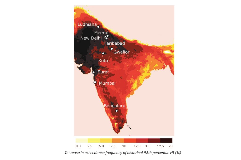
3. Heat follows different spatial and climatic patterns, and our visuals need to reflect that complexity. India’s dangerous combination of heat and humidity, especially in coastal and eastern states, often goes underrepresented. While visuals and media coverage focus on dry, arid heat, rising wet-bulb temperatures—a combination of heat and humidity—can be far more dangerous and fatal. A CEEW study found that the Indo-Gangetic Plain has experienced the highest increase in relative humidity during summers in the last decade.
4. The current visual narrative, perhaps reflecting the policy focus, is also disproportionately urban. Cities are easier to photograph, and their symbols, such as traffic congestion, crowds, and concrete, are more familiar. But impacts in rural areas, such as crop losses, worsening water scarcity, the burden of water collection on women, and rising food insecurity, are largely invisible in the imagery, despite affecting millions.

5. Additionally, most visual communication about heat stops at the problem. We rarely see depictions of practical solutions such as community cooling centres, shaded bus stops, reflective roofs, passive ventilation, or rescheduled work hours to avoid peak temperatures. Nor do we often see how heat policies are playing out on the ground, whether it is the lack of basic cooling in clinics or Anganwadis, or even where action is being taken, such as the installation of cooling stations and public health signage. The absence of such imagery not only narrows public understanding but also limits momentum for systemic change.
Tools and approaches to build a visual language around heat
To spur effective public and institutional action, it is necessary to capture and communicate heat as it is experienced, especially when impacts are complex and uneven. This is both a question of method, such as the use of photography, data visualisations or mapping exercises, and of including the communities most affected by heat in how it is documented.
1. Look up guidelines to showcase heat
Several organisations have developed thoughtful guidance on how to photograph and communicate extreme heat more effectively. For example:
- A guide by Climate Resilience for All, in collaboration with Climate Visuals, a library of climate photography, emphasises that “heat is a 24-hour story”. Their guide highlights the importance of pairing heat visuals with images of cooling solutions and avoiding tropes that oversimplify.
- The Global Heat Health Information Network has produced a guidance note encouraging the use of action-based imagery that shows both impacts and solutions, with a focus on agency and hope.
2. Rethink how we photograph heat and who gets to hold the camera
Photography used in the social sector can lean towards reinforcing stereotypes or valorising suffering rather than conveying lived experiences with nuance. This happens when visuals are taken out of context, without consent, or rely on generalised archetypes. We need more thoughtful, grounded, and collaborative approaches to storytelling, which reflect both impacts and dignity, especially with slower-onset crises like heat.
Prioritise field visits
Use field visits, interviews, and participatory methods to capture real-life settings, particularly in rural and semi-urban areas, where media coverage is thinner. Collaborate with community-based organisations and those at the frontline and ensure ethical storytelling through consent and context. Platforms such as the People’s Archive of Rural India and The Migration Story have set a strong precedent by documenting heat stress as it is lived, in places frequently overlooked by mainstream media and public discourse.
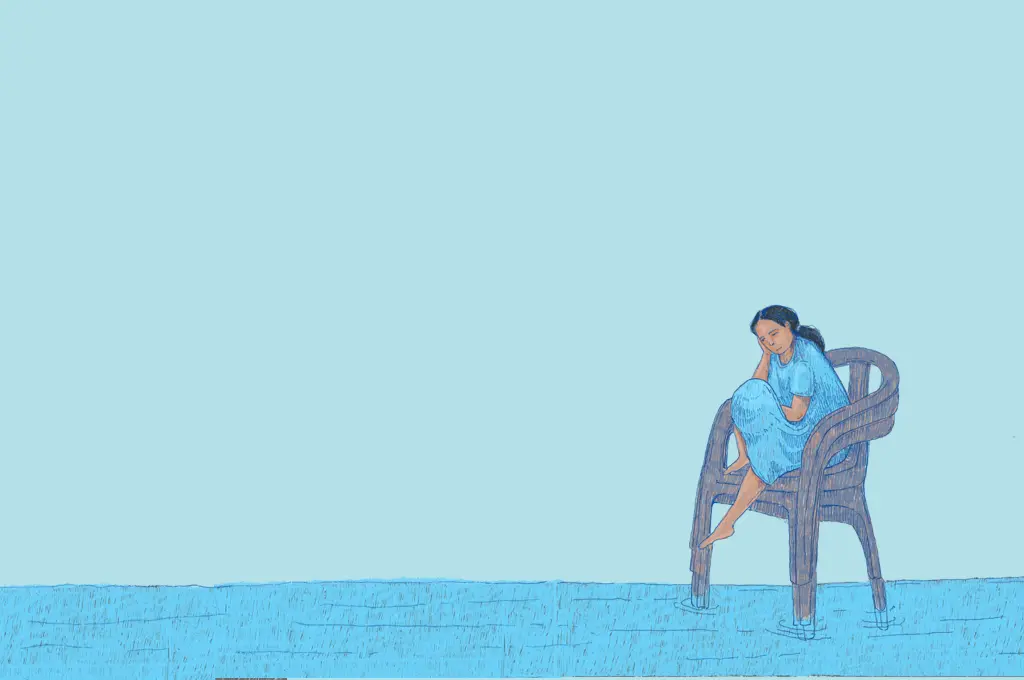
Visuals, including field photography or even illustrations informed by people’s daily lives, also help reveal the less visible dimensions of heat. For example, the impact of heat on mental health can be conveyed through a woman’s daily routine, navigating care work, chores, and exposure. The illustrations used in this recent Question of Cities feature powerfully visualise the burden women carry under rising temperatures
Follow the full heat exposure journey
Track how heat affects individuals across the day, from inside their homes to their commutes and workplaces. This helps reveal the layered, cumulative nature of heat exposure. A photo series following a person through different built environments over the course of a day could powerfully convey these contrasts. A recent photo story published in the New York Times traces the daily routine of two children navigating polluted Delhi is a strong example of how visual narratives can make environmental challenges personal, immediate, and harder to ignore.
Use photography to show how heat impacts vary over time and across spaces
Returning to the same location and capturing it under similar conditions over the years can powerfully illustrate how heat impacts evolve, whether it’s shrinking tree cover, increasing construction, or worsening urban heat islands. For example, an aerial shot of a market before and during a heatwave could help visualise the work and wages lost due to heat. This provides a much-needed temporal lens.
The impact of heat can vary across mere kilometres. A powerful way to highlight the inequality of extreme heat is by showing stark contrasts within the same city—for example, through visuals of an affluent, tree-lined neighbourhood with ample shade placed alongside a densely packed, unauthorised colony with narrow lanes and little to no cooling infrastructure.
Support citizen-led photography
Organisations working on advocacy and awareness can create open-source archives of citizen-contributed images. With a simple set of visual and ethical guidelines, this can help crowdsource a more diverse and grounded visual record of how heat is experienced across India. It could also lead to more demand for government accountability and build pressure to act. There have been similar efforts in India to document air pollution using citizen-contributed photos of the sky.
3. Using data to make heat visible
Data can play a powerful role in shaping how we understand and respond to extreme heat.
Explore data visualisation
While hard numbers are critical evidence points to showcase the impact of heat, they might not be easily comprehensible or accessible to many. Visualisation can help by transforming complex climate data into easily understandable visual formats like graphs, maps, and charts. This makes it easier for a wider audience to grasp key trends, patterns, and the urgency of the crisis. Climate stripes, for instance, create a simple yet striking visual, turning decades of temperature data into compelling, emotionally resonant images. There are several examples of people and organisations using similar approaches to visualise extreme heat:
- SEEDS India developed a hyperlocal data layering method that overlays roof types and construction materials with temperature exposure data to identify which neighbourhoods are likely to experience dangerously high indoor temperatures.
- Greenpeace India created a community cooling needs map for Delhi, highlighting where community-led cooling centres currently exist and where more are urgently needed.
- Tools to visualise heat, such as NASA FIRMS (for fire and thermal anomalies), land surface temperature maps, or C40 Cities’ urban datasets, are accessible and can be used to tell stronger visual stories about extreme heat.
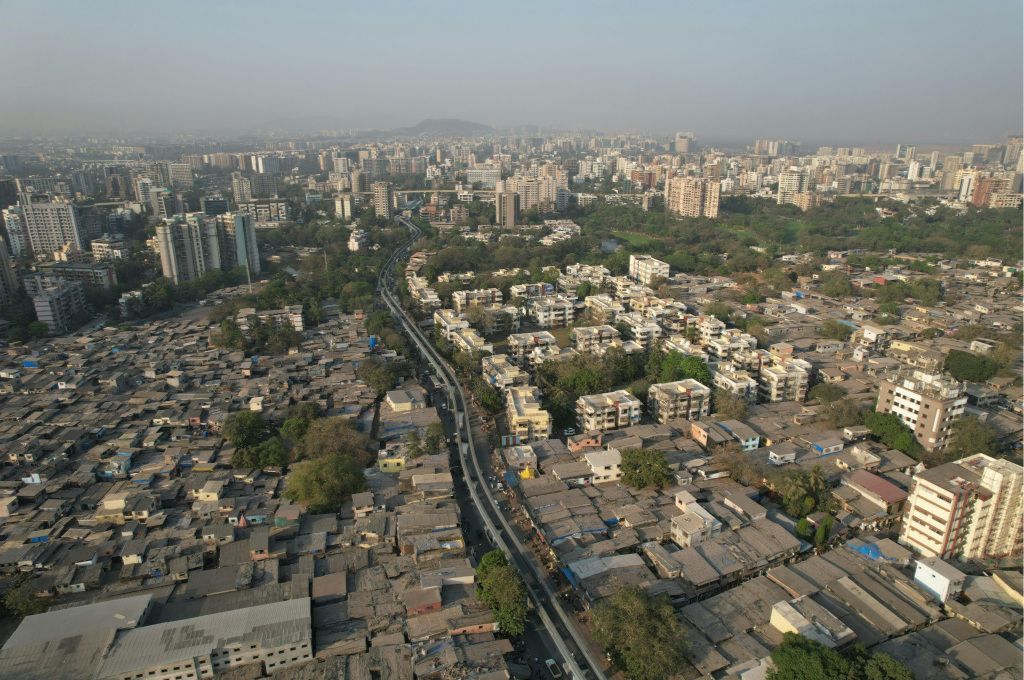
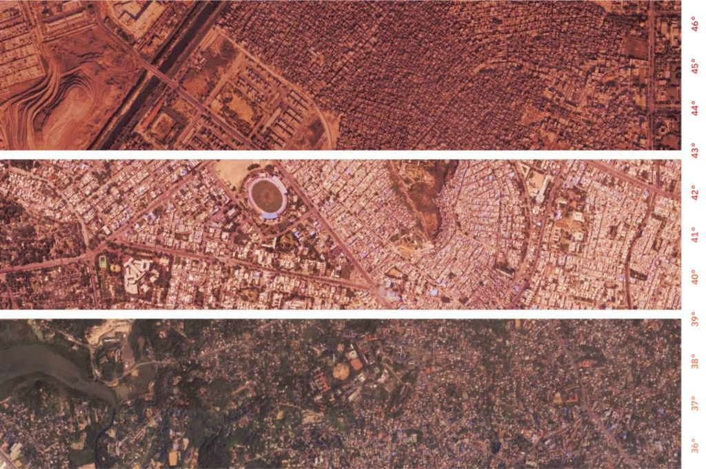
Use satellite imagery to compare heat impacts across different built environments
A satellite view of a city can show stark differences between affluent neighbourhoods with green cover and densely built, low-income areas with little shade. Photographer Johnny Miller’s Unequal Scenes project is an example that uses aerial imagery to expose dramatic inequalities in cities. One effective design approach to using such satellite imagery is to use saturated colour gradients to highlight more vulnerable areas. Tools such as Google Earth Engine can be useful for layering historical satellite imagery to reveal these shifts. This draws visual focus to where the risk is highest and reinforces the need for targeted adaptation measures.
We tried to apply this approach in a recent SFC report on heat resilience. We used satellite imagery from three cities, highlighting differences in built density and shade cover, overlaid with a temperature scale. The goal was to show how urban design shapes heat exposure and to make a stronger visual case for better planning.
Visualising and communicating heat effectively can do more than raise awareness. When done well, it can help decision-makers prioritise vulnerable areas, support communities in demanding better services, and influence how adaptation strategies are designed and funded.
As momentum builds in India’s climate ecosystem with more donors supporting research, adaptation, and resilience, there’s also an opportunity to centre communication as a key part of the response. This opens up powerful avenues for collaboration: between funders, practitioners, designers, and communities, to tell stories that are grounded in evidence, urgency, and lived experience.
Building a stronger visual narrative for climate action: What funders can do
Funders are uniquely positioned to shape how the crisis is communicated, which is a crucial lever for driving public and political action in the first place. Here’s how:
1. Create shared visual infrastructure
Donors can support the creation of a common photo and video repository across grantee organisations working not just on heat but connected issues. This would serve as a shared visual resource, curated with basic metadata such as location, consent status, the story behind the image, and sectoral relevance (health, labour, housing, etc.). A searchable, rights-cleared library like this could help communicators, researchers, and media outlets access more representative and nuanced visuals of heat impacts and solutions, especially from hard-to-reach regions.
2. Grants for visual storytelling
Donors can provide direct grants or fellowships for grassroots storytellers, photographers, and community media groups working in heat-affected regions. They can also support collaborations between designers, data visualisers, researchers, and field workers to co-create compelling visual materials. For instance, as part of its broader work on conservation and climate resilience, Rohini Nilekani Philanthropies has supported multimedia storytelling initiatives, including documentaries, film festivals, and photography exhibitions. The organisation has also experimented with storytelling grants as part of broader capacity-building support, allowing nonprofits to build their communications capacity and expand coverage of climate-related issues.
3. Strengthen visual standards and ethics
Philanthropic institutions have convening power. They can use it to bring together grantees, media partners, researchers, and practitioners to co-develop ethical guidelines and best practices for visualising heat and other climate impacts. This includes how to show vulnerability without reinforcing stereotypes, when to show people’s faces, how to represent heat beyond clichés, and how to visually link climate to sectors like health, labour, and housing.
If we want sustained action on heat, we need to make it visible in the right ways. That means building a visual language that reflects not just temperature, but vulnerability and resilience. One that captures the unevenness of exposure and access to cooling, and one that helps shift response from reactive to systemic. The tools are available. The stories are already unfolding. We just need to start showing them.
Aditya Valiathan Pillai, Bhargav Krishna, Kritika Trehan, Pritish Bali, and Tamanna Dalal contributed to this article.
—
Know more
- Understand how heat impacts people’s livelihoods in the informal sector.
- Learn about heat stress indoors and its disproportionate burden on women.
- Read this report on access to green spaces and cooling infrastructure during peak heat.
Do more
- Submit a photograph to the extreme heat photo context organised by the Global Heat Health Information Network and the Earth Journalism Network [Deadline: August 29, 2025]